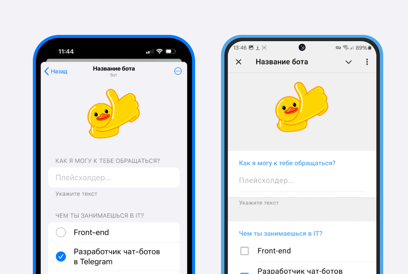
A mini app is a Telegram element that is essentially a web page opened inside Telegram or Max; in Telegram it uses the extended capabilities of the Mini App Api. All mini apps are integrated into bots. The mini app design is adapted to the iOS and Android look and feel.
Related articles:
Important! Before you start setting up a mini app in puzzlebot, first enable Mini App mode in your Telegram bot.
Learn more: Adding a mini app to a Telegram bot
Before reading the text instructions, we recommend watching the videos:
Creating a mini app in the chatbot builder for Telegram
Mini app update
How to create a mini app in Max for event registration
Creating mini app content and settings
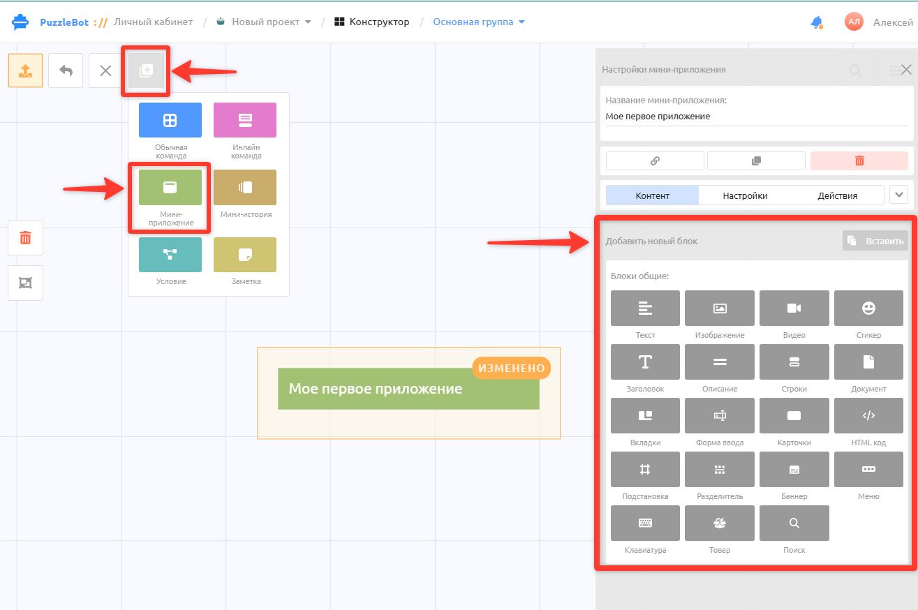
In the Constructor section, create an app or select an existing one.
The Content tab contains a set of blocks used to build all the visible content of the app.
Important! When you create two or more mini apps, we call each created entity a "mini app", but this does not mean that separate standalone apps are created in the bot. In practice, it is one single app, and each "mini app" is a separate page with its own content, actions, and the transitions that link the pages together.
Mini app block features
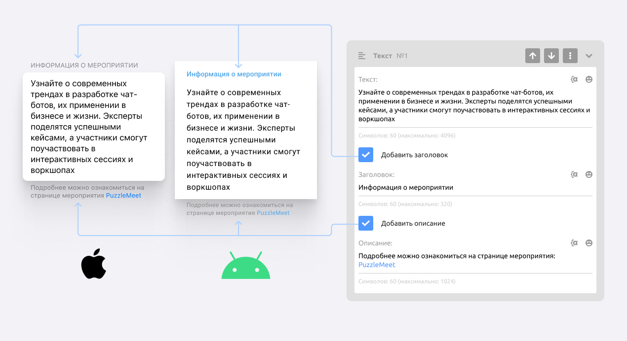
You can add a heading and a description to blocks.
Let's look at the settings of some of the blocks.
Text block
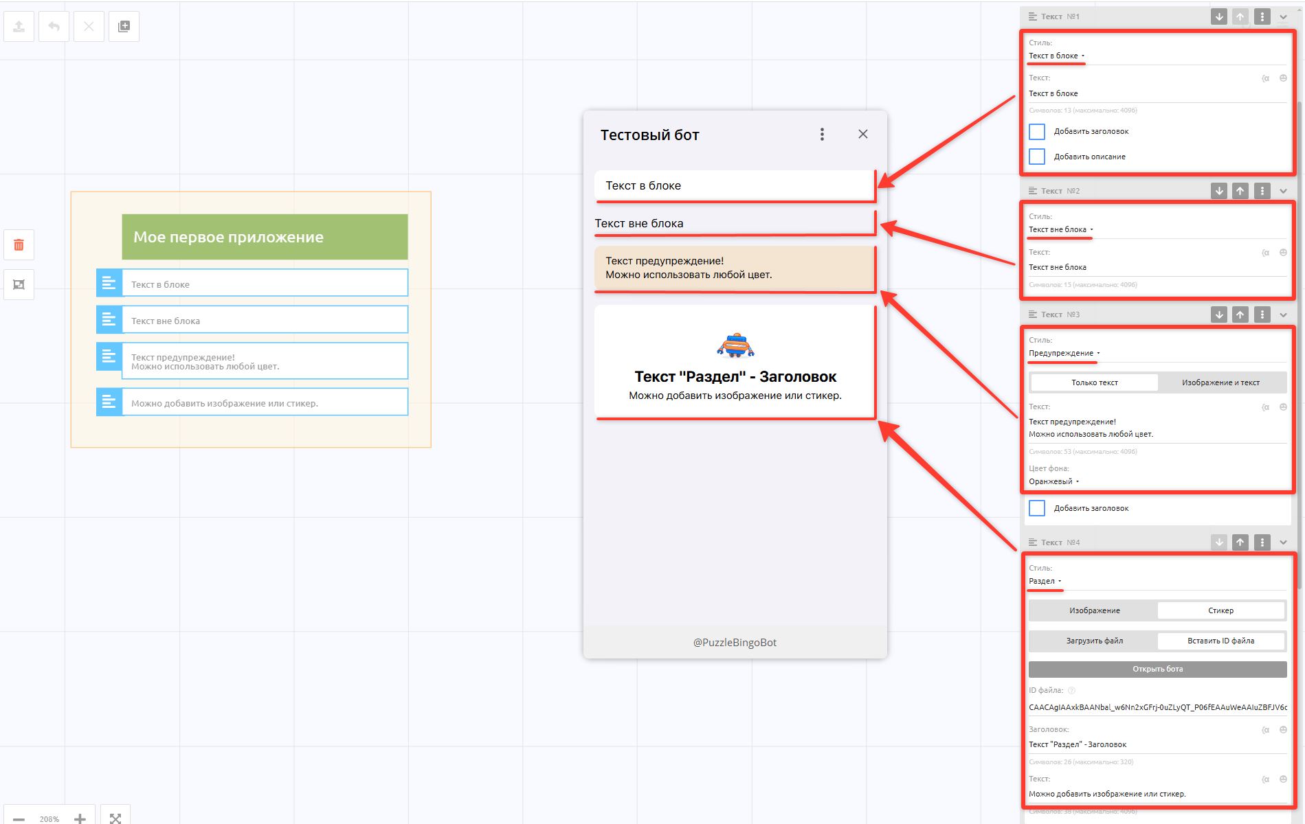
Text — a standard text block that comes in different styles:
• Text in a block — has its own background
• Text outside a block — plain text with no background or settings
• Warning — text with a customizable background color and an optional 160x160 icon
• Section — also has a heading and requires an image or sticker.
Image block
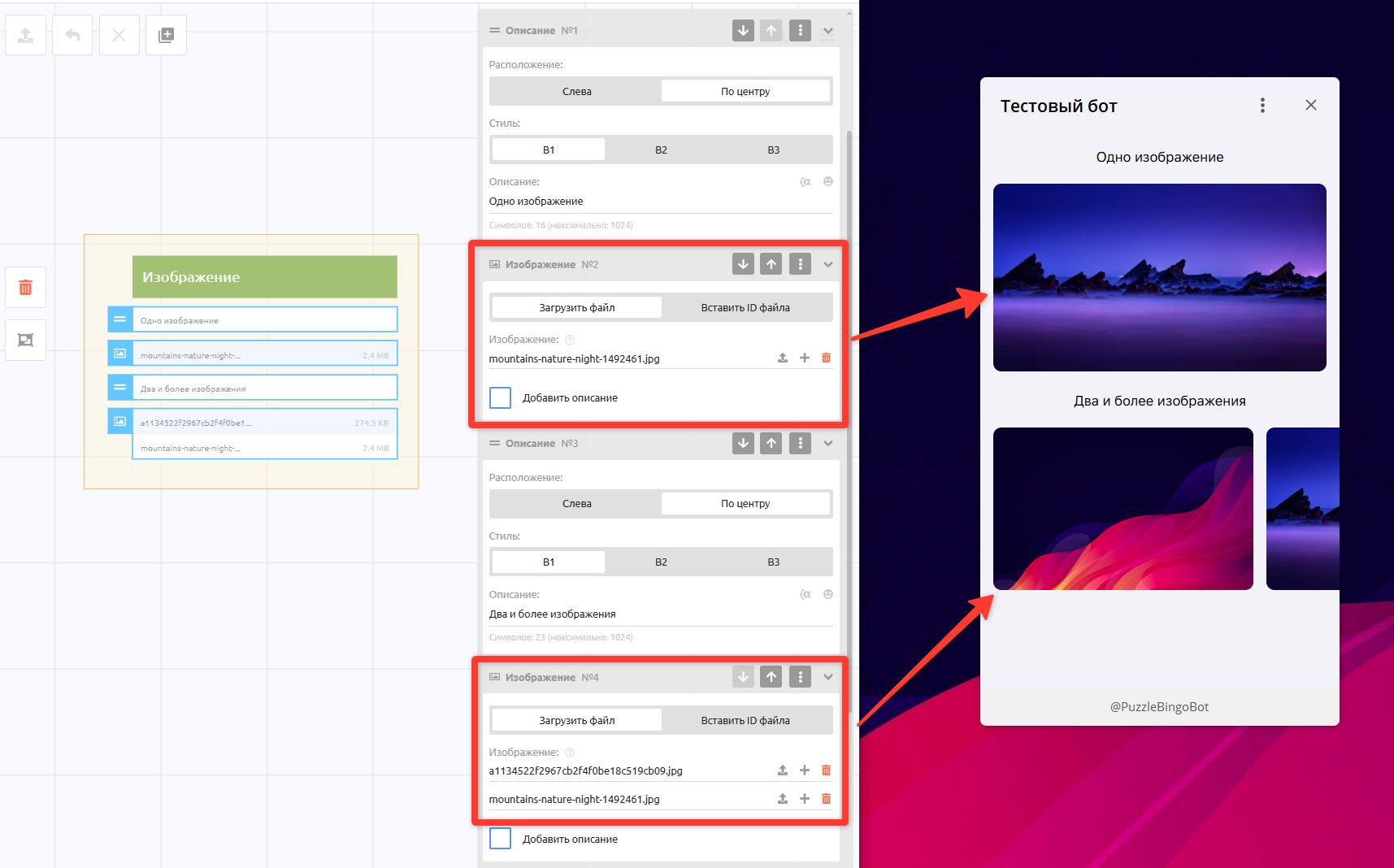
This block lets you upload 1 to 30 images.
If you upload 1 image, it is automatically stretched to the full width, keeping its proportions, with no height limit.
If you add 2 or more images, the block works as a carousel with a limited height.
Maximum image size: 5 MB
Video block
Displays a video hosted on one of the following platforms: YouTube, Vimeo, VK, Dzen, RuTube, OK. In the block, enter the video link from the address bar.
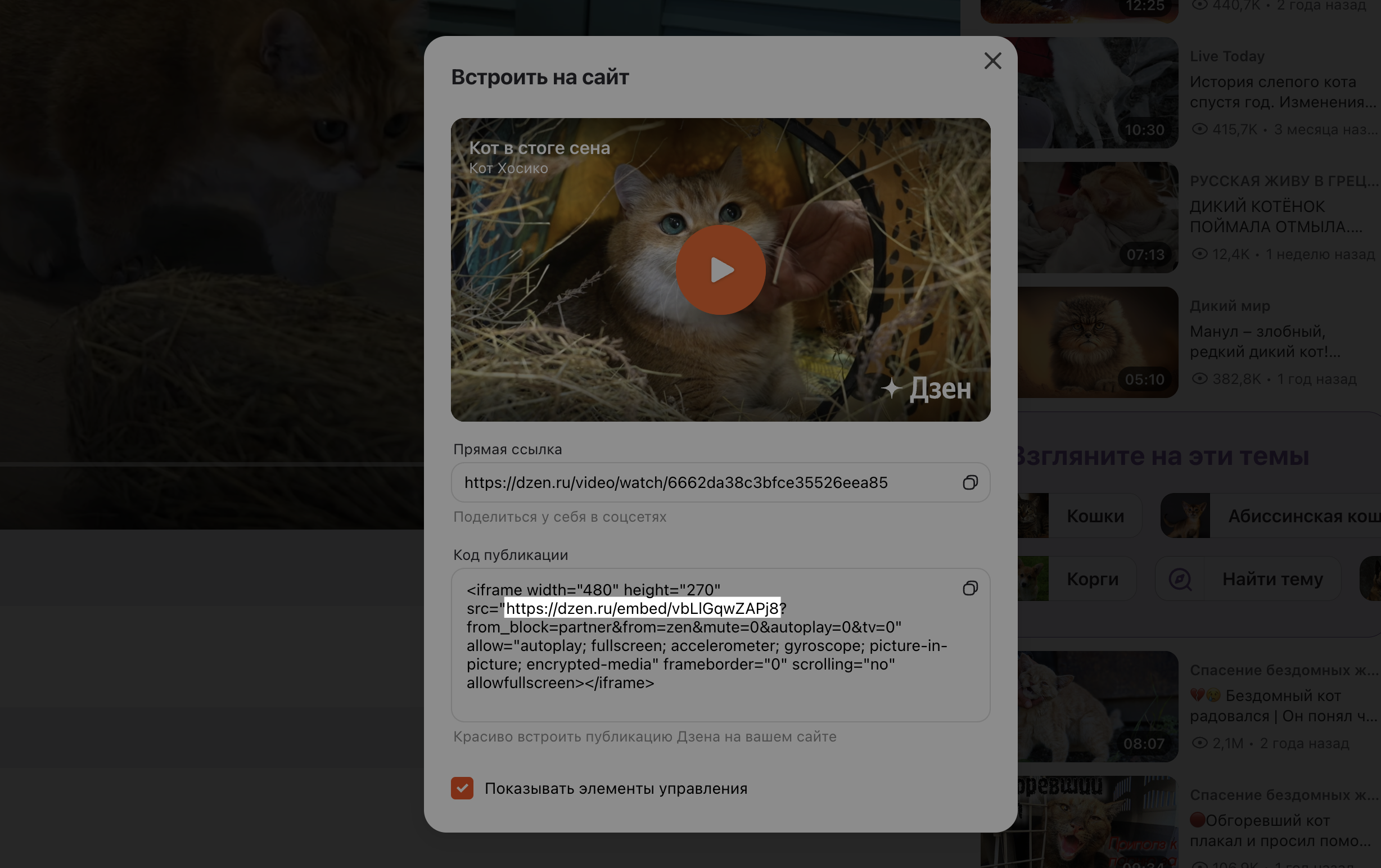
Dzen requires a special link. To find it, click the three dots under the video — Share — Embed.
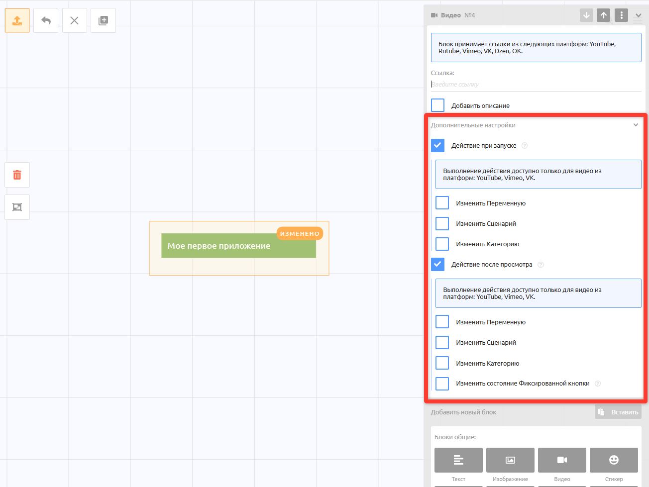
The Video block has additional settings that let you perform actions when the video starts or after 95% of it has been watched.
For example, you may want to record that the user started watching by changing a variable or category, or start a reminder scenario if the user has not moved on.
The Change Fixed button state setting lets you activate the fixed keyboard's action after the video has been watched, for example so that the user can proceed only after watching the video.
Sticker block
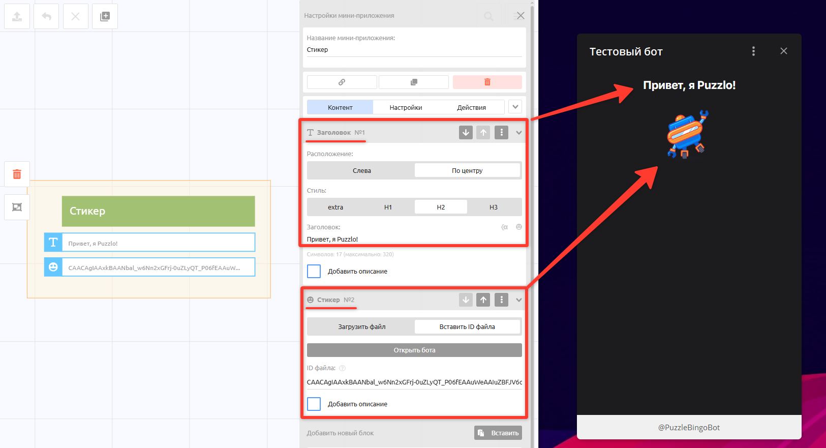
This block can display an animation in .TGS (the Telegram sticker format) or JSON format.
Maximum sticker size: 50 MB
To quickly upload a sticker straight from Telegram, open the bot and run /cp → Upload file → Send a sticker. You will get a file ID; paste it into the Sticker block
Heading block
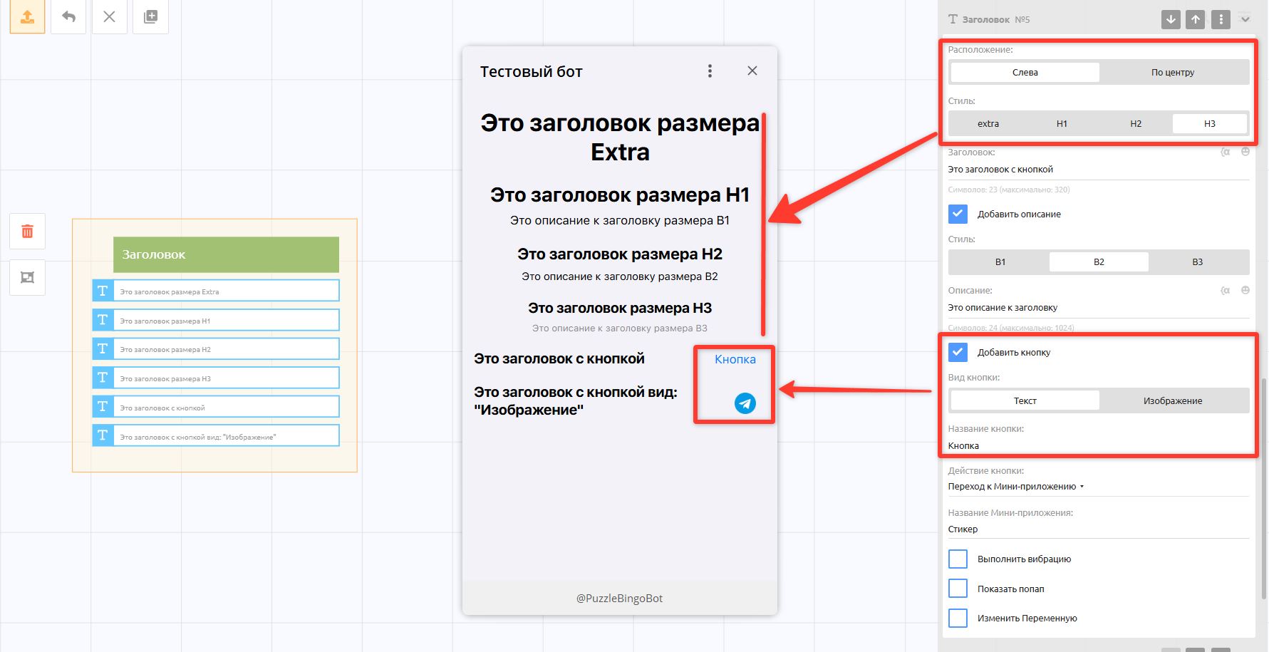
The Heading block has alignment and size settings. If the heading is aligned "Left", you can also add a button to the right of the heading; the button can be text or an icon no larger than 160x160.
Description block
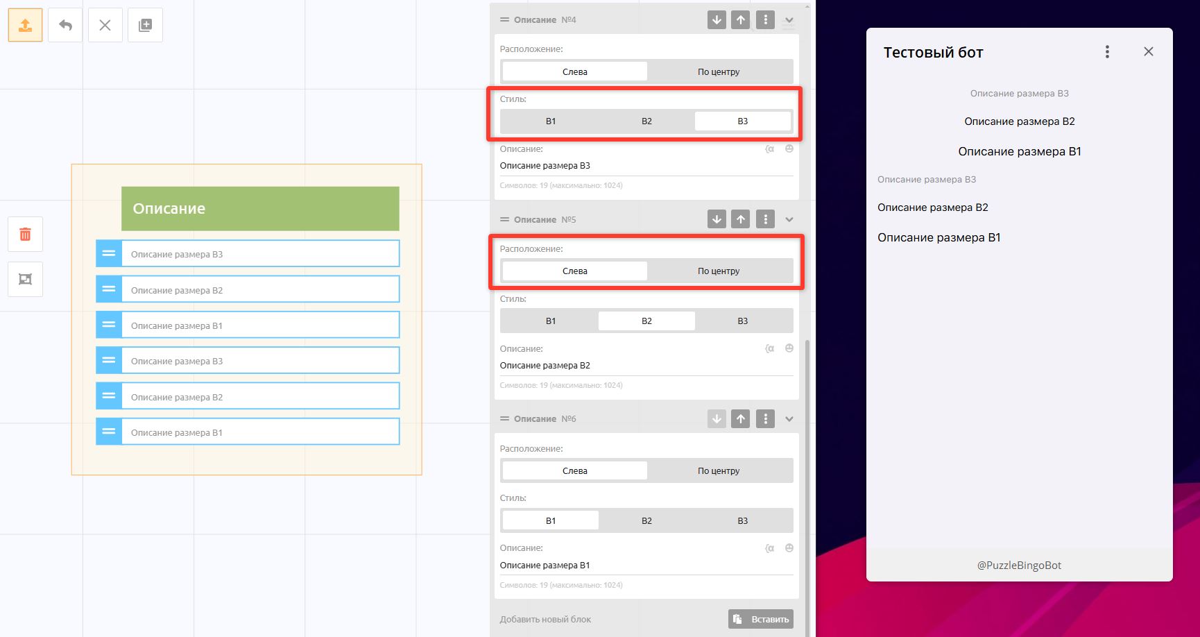
The Description block is smaller text with no background; it also has alignment and font size settings.
Rows block
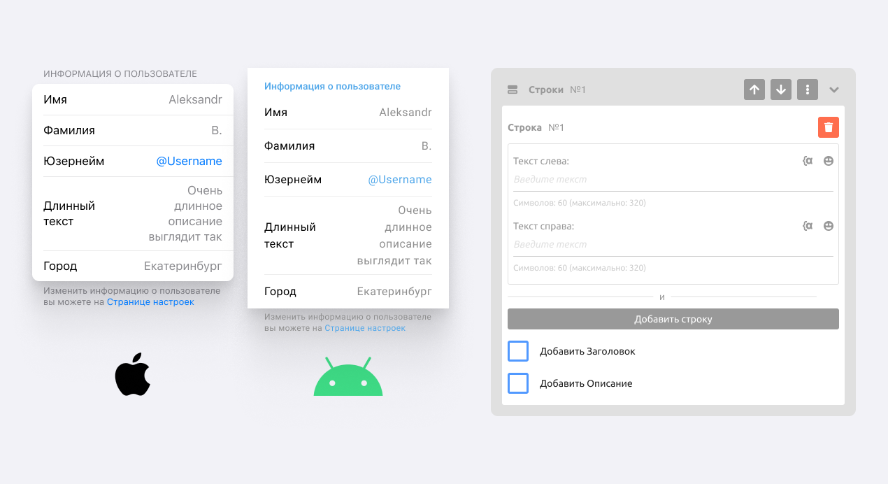
In this block, you can create rows of information in the Name: Value format
For each row, you can upload an icon image with a resolution of 160x160.
Document block
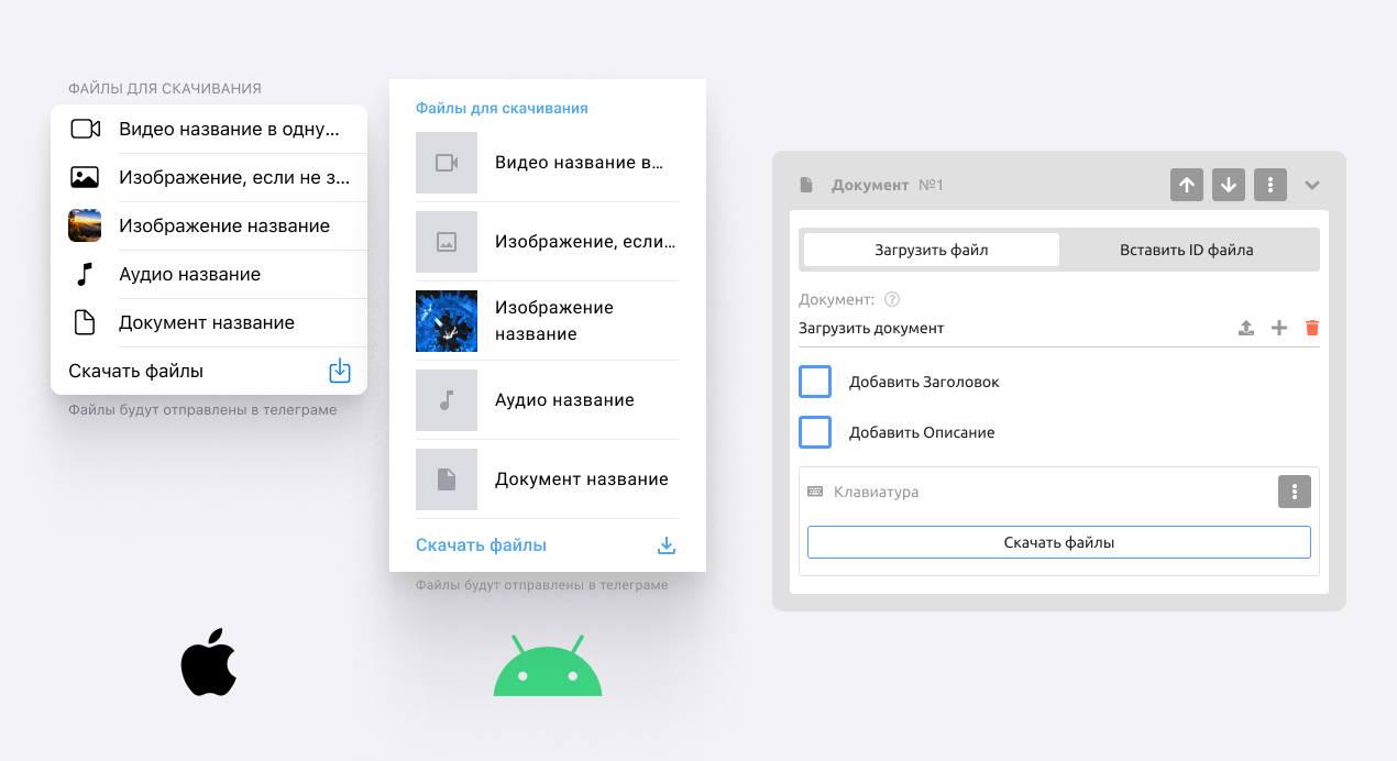
This block lets users download documents one by one or all at once. Documents are sent to the private chat with the bot.
Tabs block
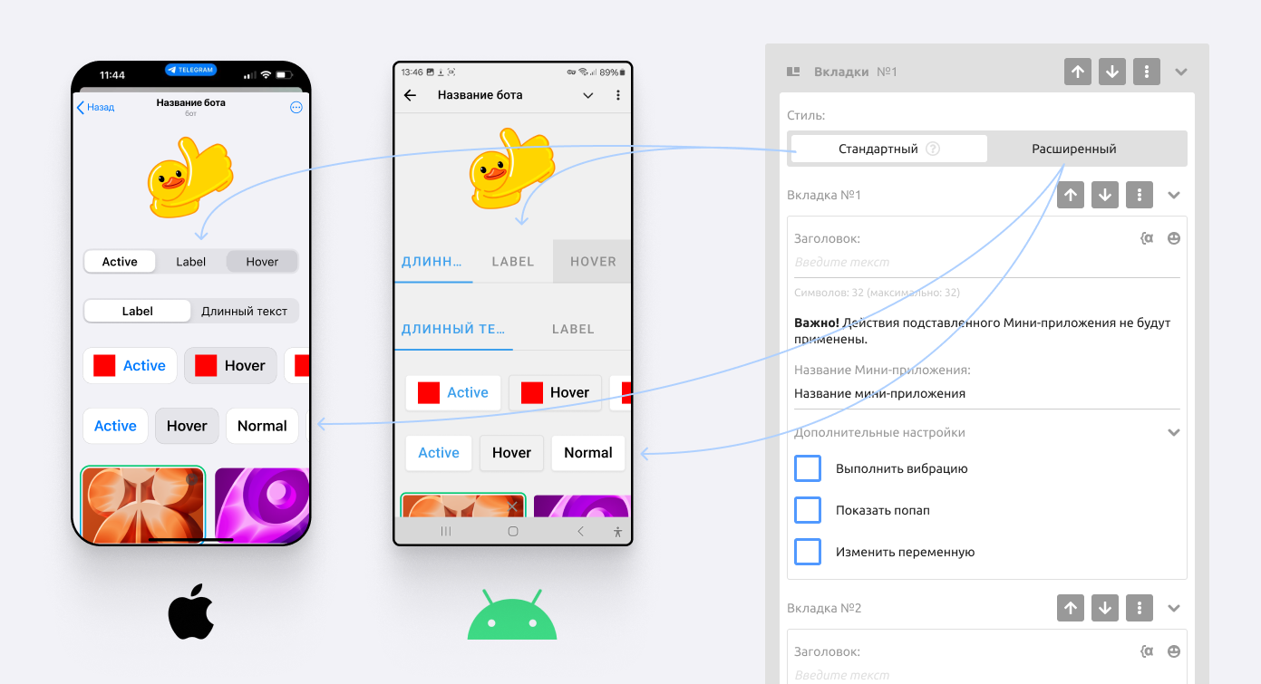
Tabs work by insertion: in each tab, you specify the name of another app, and its content is inserted into the page when the tab is selected. This block is great for creating product categories for the Store: for example, you can create "Shoes" and "Clothing" tabs to show the pages (apps) with those products.
Standard tabs hold up to 5 pages,
Extended tabs hold up to 24 pages + the option to upload a 160x160 icon.
Input form block
Input forms are covered in detail in the article: Input form. This section describes what is specific to input forms in a mini app.
Important! When you use an input form, a Keyboards block is automatically added to the mini app with the Fixed type. If the mini app already has a Keyboards block with the Fixed type, it is replaced.
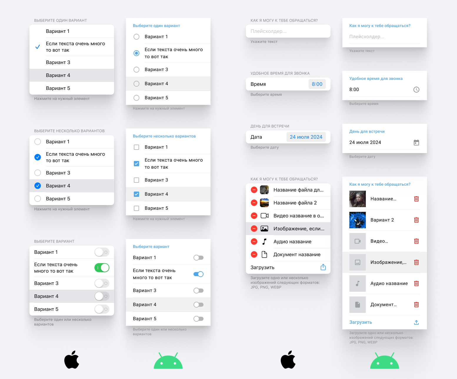
Input forms in a mini app have the following extra features:
Duplicate answer to a variable — copies the form answer to a custom variable.
Required form — makes an answer to the form mandatory.
Repeat submission — allows or forbids answering the form again. If forbidden, the form is still displayed, but in a disabled state, with no way to choose an option or send an answer.
Insert answer from a variable — displays the input form with a prefilled answer that the user can erase.
Add description — lets you add a description to the form, such as a hint or a note.
For an input form of the Option selection type, buttons have a Select by default setting that lets you preselect popular answer options.
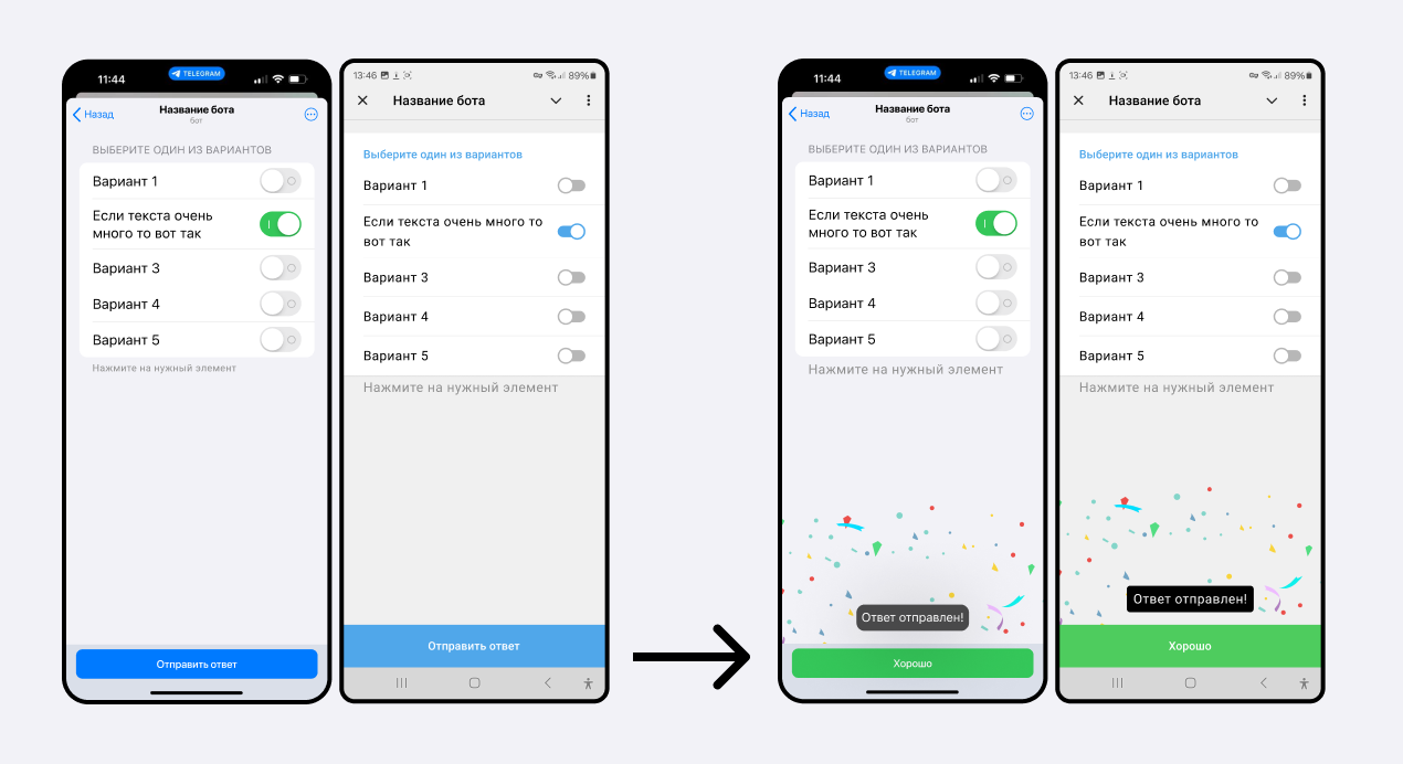
A confetti effect plays when the user answers an input form.
Input form block with the List type
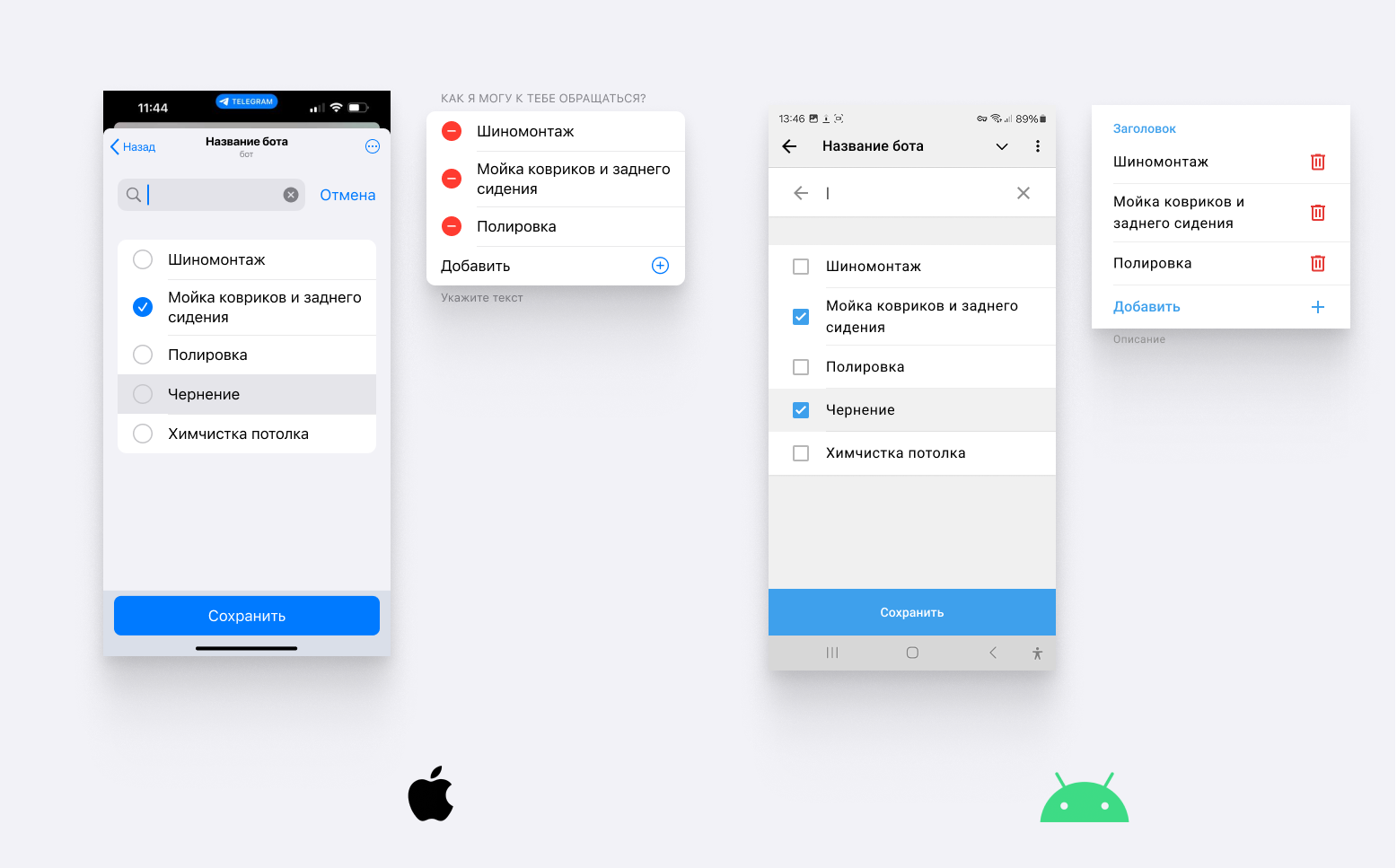
This input form type lets the user choose one or more options from a list. Its special feature is a search across the options (when there are more than 10). This type also offers 3 ways to add options:
Through your puzzlebot account — up to 16 options
With a text document — prepare a plain .txt file with content like this:
Option name 1 = Value 1
Option name 2 = Value 2
...Option name N = Value N
3. By connecting to Google Sheets or NocoDB tables
Input form with the Currency selection type
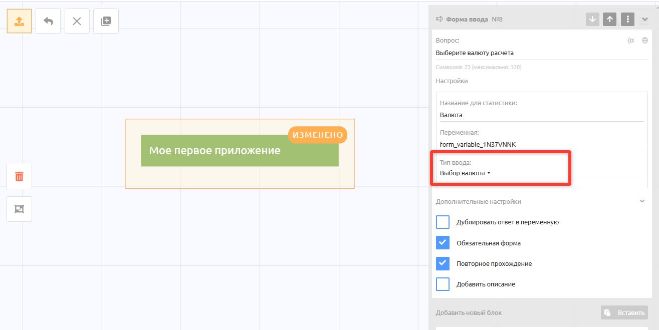
This input type is needed only for the Store. If you have several payment systems connected that accept several currencies, it is important to ask for the currency before the store opens; product prices in the store are then shown in that currency.
Cards block
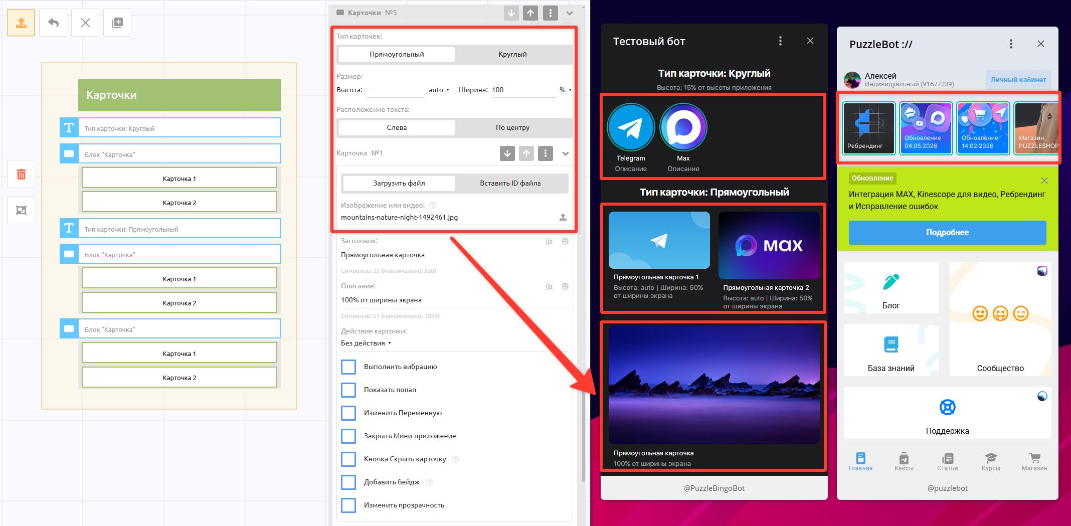
This block lets you create buttons in the form of cards that users can swipe through and tap like buttons.
Card type: Can be round or rectangular.
Card size: You can set the height and width. Automatic size is set initially, in which case the card is displayed at its original size.
You can change the units to pixels or percent.
If percent is set, the width or height is specified as a percentage of the app's width or height.
For example, if you set the card width to 50%, the card stretches together with the app, keeping a width of 50%.
If you set one parameter to an exact value and the other to auto, the image is resized to the given parameters without distorting its proportions.
Card: An image or video up to 50 MB.
Optionally, you can add a heading and a description that appear below the card.Card actions: You can choose the same actions as for buttons, or leave the card without an action.
Vibrate: Sets the vibration on tap
Show popup: A popup window with text shown after the card is tapped; you can add a button.
Change variable: Lets you specify a variable to change after the card is tapped.
Close mini app: The app is closed after the card is tapped.
Hide card button: When on, a cross for hiding the card is shown in the corner of the card. Available only for the Rectangular type
Add badge: Lets you add eye-catching text in the corner of the card, for example "Sale", "New arrival", or "Good to know".
Change opacity: The card's transparency percentage
In the additional settings for the whole block, you can choose these options:
• Mark new cards — cards that have not been viewed get a special outline
• Move viewed cards to the end — after a card is viewed or tapped, it moves to the end, after the other cards.
• Show a specific card — you can specify the number of the card to be shown on the page by default, even if it is the last one
HTML block
Lets you insert HTML code between the <body></body> tags.
Important! In the mini app's additional settings, as well as in the bot's global settings, you can set HTML code that is inserted between the
<head></head>tags.
Useful information:
The
.block-iosand.block-androidclasses are special CSS classes for showing an element only to iOS or Android users respectively. Example:<div class="block_ios">You have the iOS theme</div><div class="block_android">You have the Android theme</div>
2. The goto_web_page attribute for the <a> tag — goes from one mini app to another without opening a new window. It takes the mini app ID (for example: bb0ad173446c99b1); after the page loads, this attribute is replaced with href containing the required page URL. Example:
<a goto_web_page="*second page ID here*">Go to the second page</a>
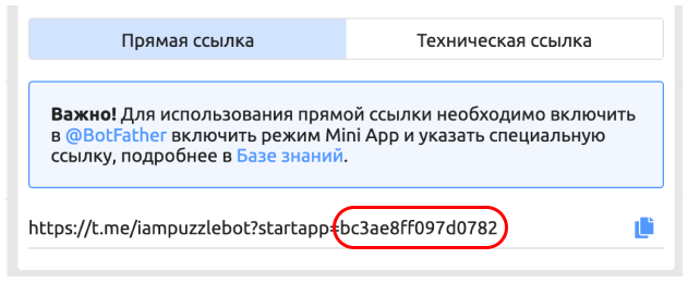
The highlighted code is the mini app ID.
3. The gotoWebPage("mini_app_id", true | false) function — goes from one mini app to another. It is an equivalent of the previous option. The second argument is optional and defaults to false. If it is false, the specified mini app opens in the current window; if it is true, it opens in a new window.
<button onclick="gotoWebPage('*second page ID here*')">Go to another page</button>
4. The getWebPageUrl("mini_app_id") function — returns a correctly formed link without navigating to it. Example:
<script> var other_page_url = getWebPageUrl("bb0ad173446c99b1") setTimeout(function() { window.location.href = other_page_url;//this example is made up; gotoWebPage would have been enough here }, 3000);//navigate after 3 seconds</script>
Insert block
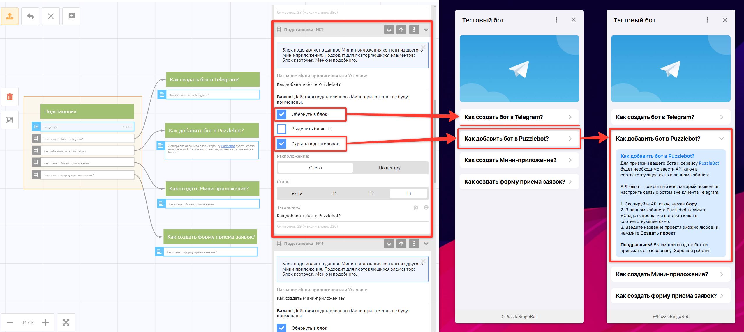
This block inserts content from another mini app into the current mini app. It suits repeating elements, such as a Cards block or a Menu, and expandable information in a question-and-answer format.
Important! If the other mini app that you specified for insertion has actions, they are not performed.
Settings
Wrap in a block: Adds a separate, distinct background for the inserted block
Highlight block: Available if Wrap in a block is selected. On iOS, the left and right margins from the screen edges are removed, and on Android they are added, which makes the block stand out visually from other blocks.
Hide under a heading: The inserted content is hidden under a heading that the user taps to expand it. See the example in the screenshot above.
Divider block
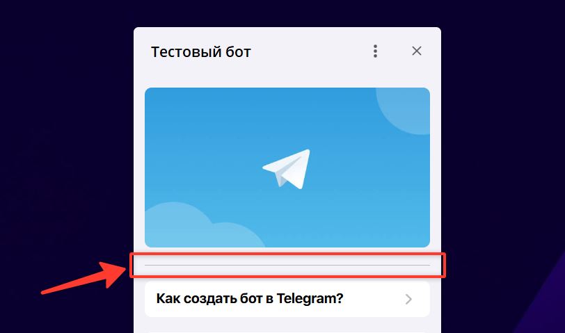
A visual divider in the form of a horizontal line
Banner block
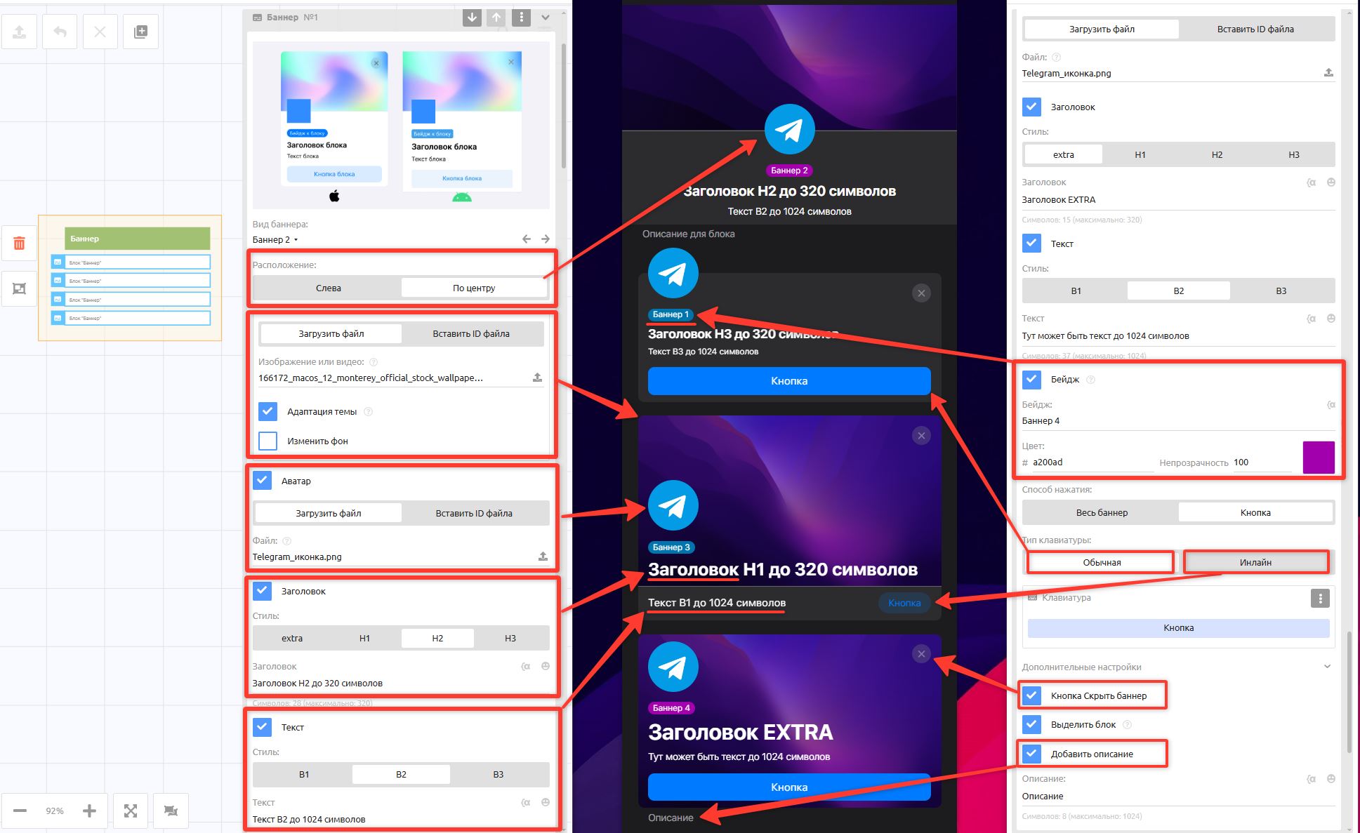
A banner is a visual block that lets you liven up your mini apps and emphasize information. Currently, 4 banner types are available, with flexible settings for the displayed elements: background, heading, avatar, badge, and more
It suits important messages, promotions, and navigation.
Let's go through the settings
Alignment: Left or Center — the position of all elements in the banner
File upload: An image or video for the banner, up to 10 MB.
Theme adaptation: If the background is dark, the elements on top of it use the light theme's color, and vice versa.
Change background: Lets you set your own color.
Avatar: An optional avatar or logo shown as a round block.
Heading: Bold text up to 320 characters with a font size setting.
Text: Regular text up to 1024 characters with a font size setting.
Badge: Eye-catching text on its own colored background that draws attention. You can put a variable in the badge text; in that case, the badge is shown if the variable has a value and is not shown if it is empty.
Tap area:
Whole banner — with this setting, the banner itself acts as a button and responds to taps anywhere on it.
Button — lets you set a Regular or Inline button with its own action.
Additional settings
Hide banner button — a "×" cross in the corner of the banner that lets the user hide it. Important! Once the banner is closed, the user cannot see it again, even after restarting the app.
Highlight block — On iOS, the left and right margins from the screen edges are removed, and on Android they are added, which makes banners stand out visually from other blocks. See the example in the screenshot below.
Add description — lets you add semi-transparent text at the bottom of the block.
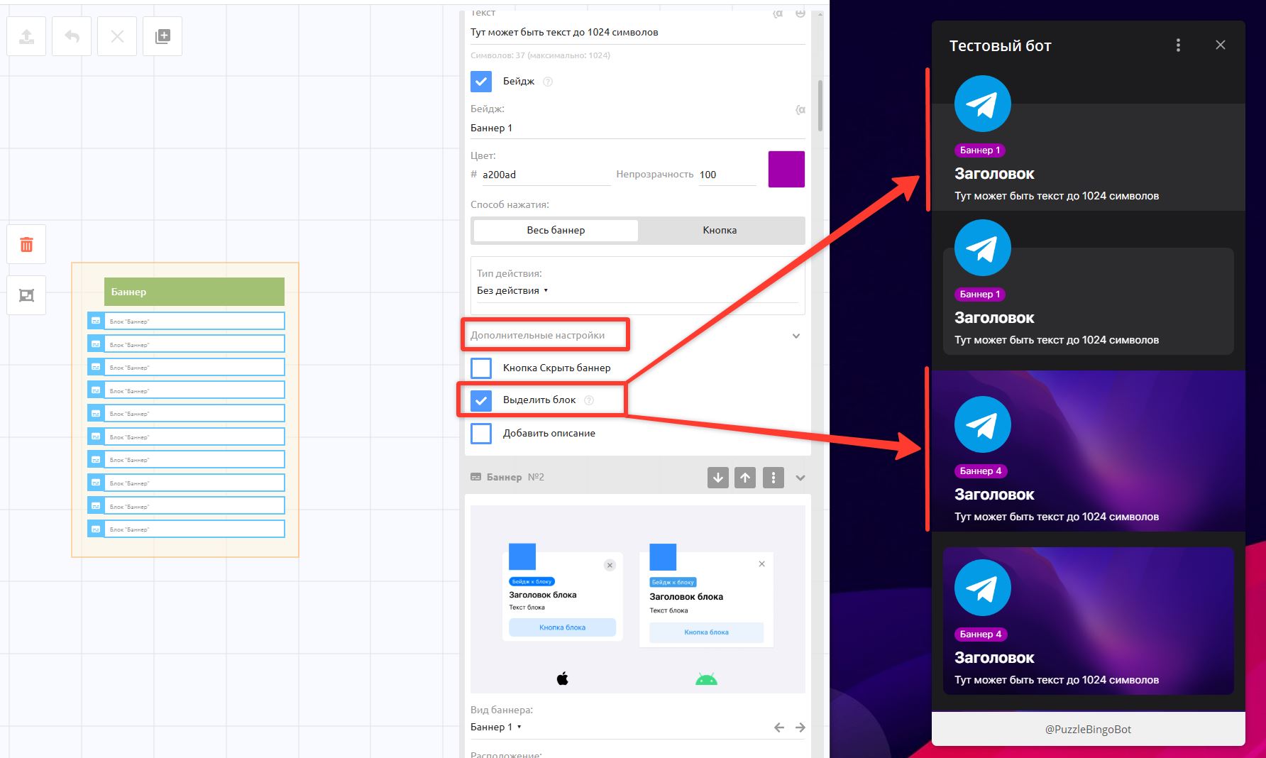
The "Highlight block" setting
Menu block
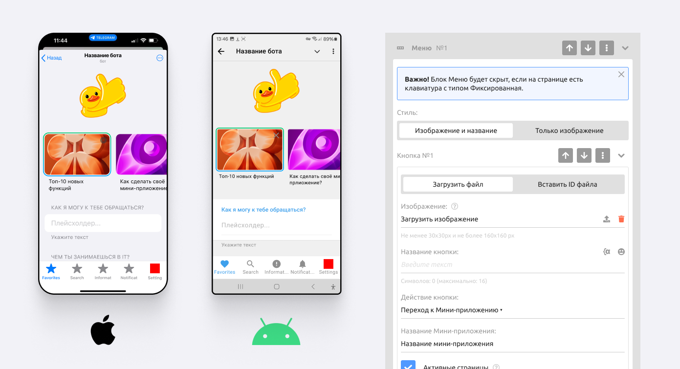
The Menu block lets you create a fixed menu at the bottom of the app.
Important! The Menu block is hidden if the page has a keyboard with the Fixed type.
Settings
Style: the button style — an icon with text or an icon only.
Image: upload an icon as an SVG image.
Button name: The text under the button icon.
Button action: The action to perform; in this case, going to another mini app
Active pages: Specify the mini apps on which the button is shown in the active state. This is needed if you created the keyboard in one app and then referenced it in other apps through the Insert block to duplicate the keyboard: for each button, specify the pages (apps) on which it is highlighted as selected (active).
Vibrate: Sets the strength and type of vibration on tap.
Show popup: A popup window with text.
Keyboard block
Unlike a keyboard in the bot, a keyboard in a mini app can exist separately from blocks. There can be any number of keyboards, except for the keyboard with the Fixed type.
For each button, you can set up actions and vibration.
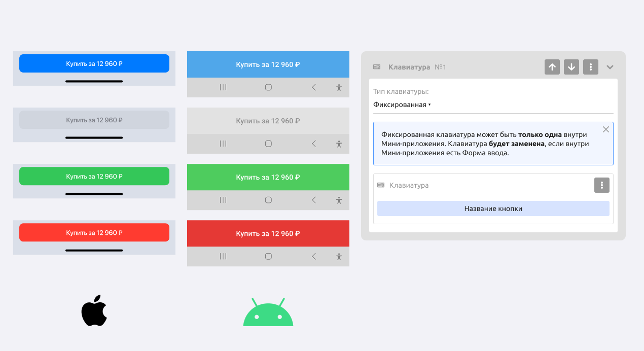
Keyboard type: Fixed. There can be only one per mini app.
Important! The fixed keyboard may be replaced if there is an input form inside the mini app.
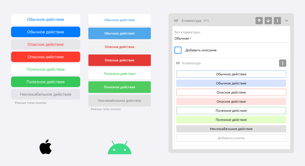
Keyboard type: Regular.
Has color and background settings: With background, Semi-transparent, No background
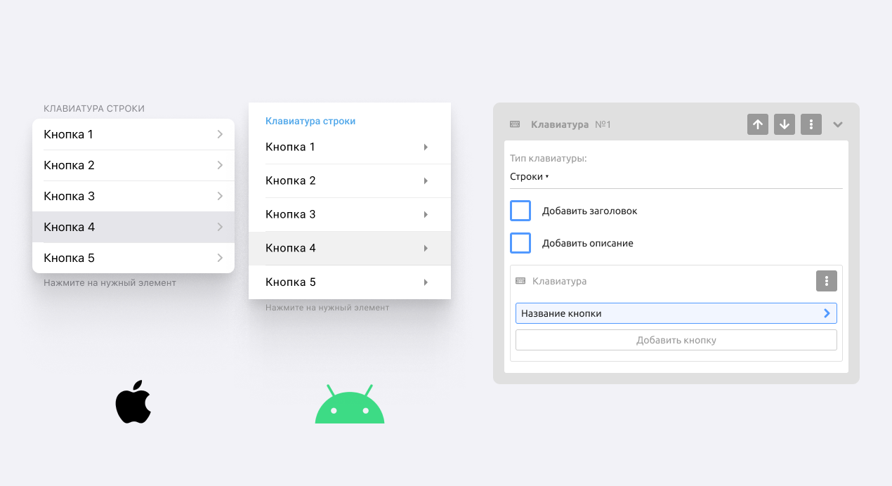
Keyboard type: Rows.
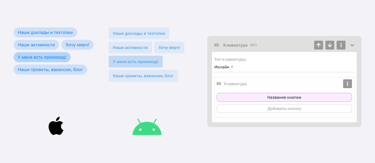
Keyboard type: Inline.
Product block
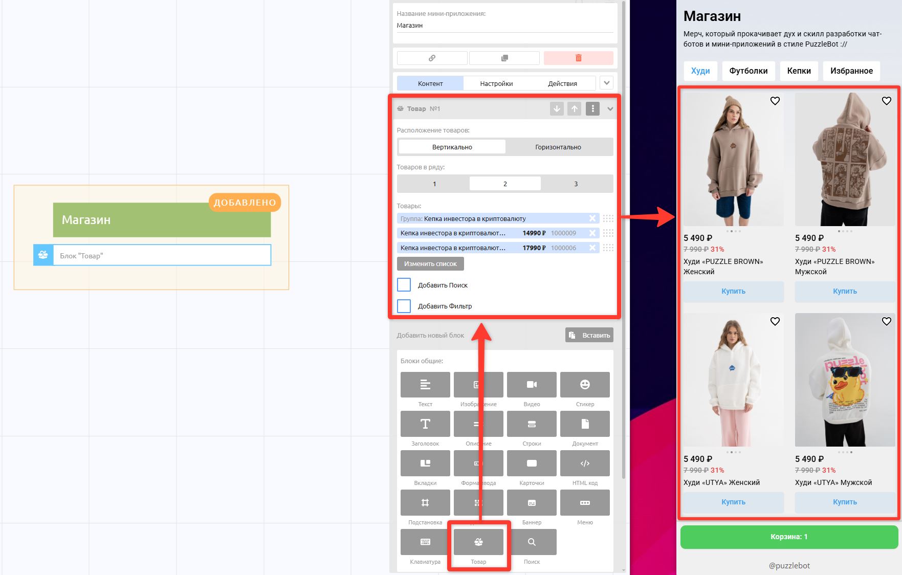
Product — a block for displaying in the app the products created in the separate Store module.
Use the Store to create products. Learn more: Store section overview
Search block
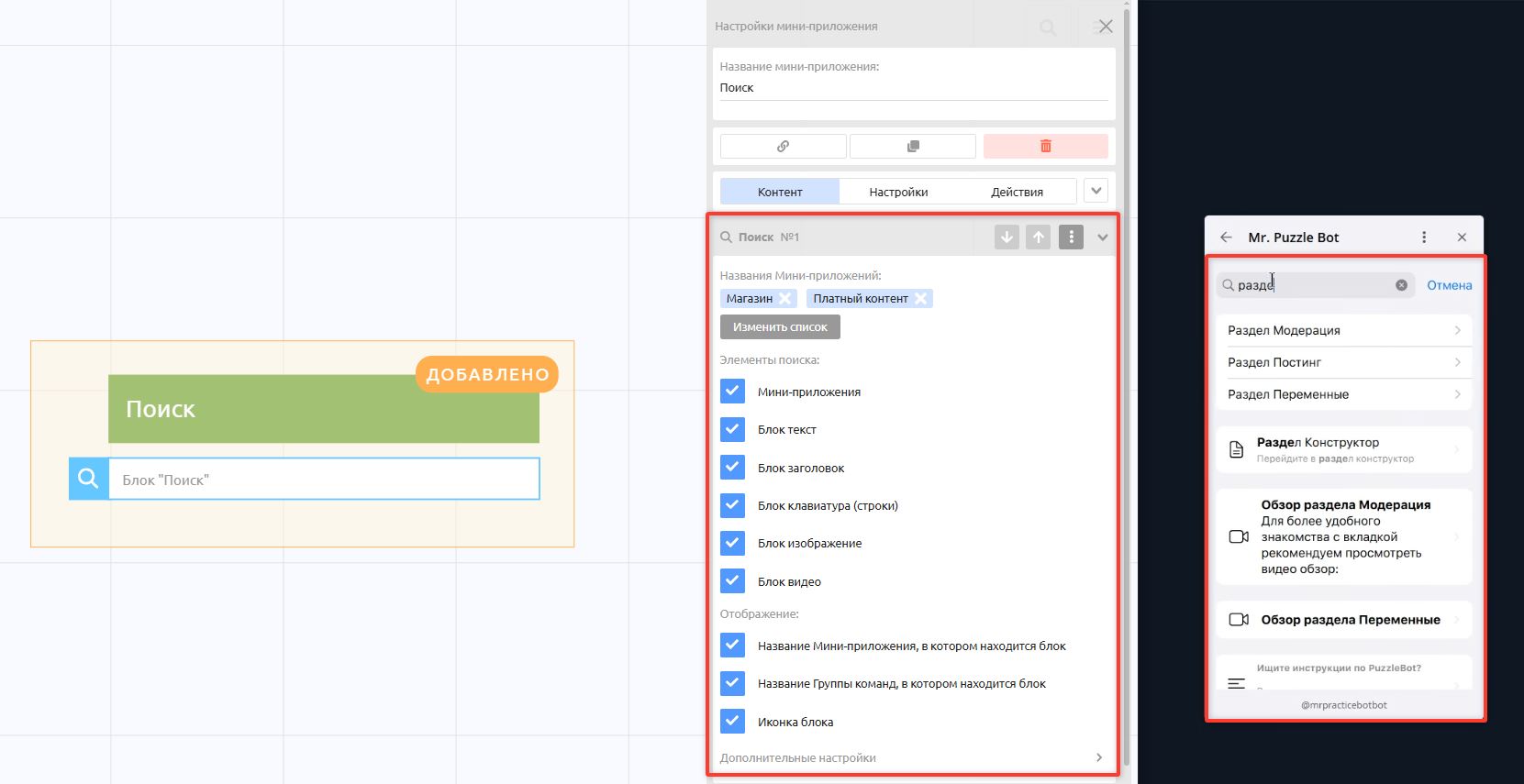
A block that lets users search for text, images, videos, and buttons inside the mini app.
Settings
Mini app names: Specify which apps or command groups are indexed by the search. For example, you may have an app for administrators and not want its content to be found through search. Specify only the ones you need.
Search elements: Choose which blocks in the app are indexed by the search. For example, you may want the search to cover only text blocks.
Display: Specify what is shown in a found block.
App search settings
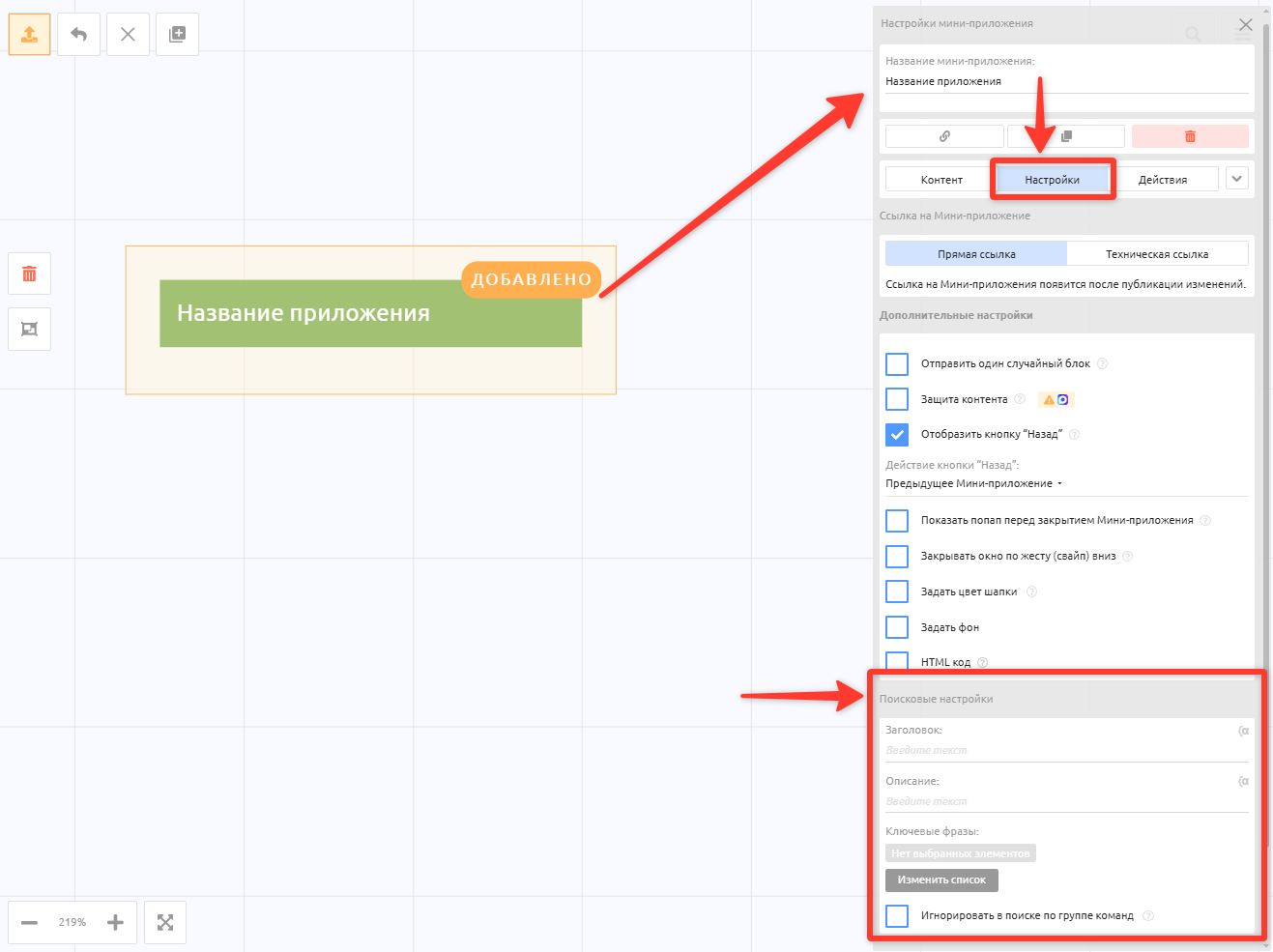
Search settings are the settings for the Search mini app block.
In each app, under Settings → Search settings, you can specify a heading and a description that are shown only in search. You can also specify additional key phrases by which this app's blocks are indexed.
Popup
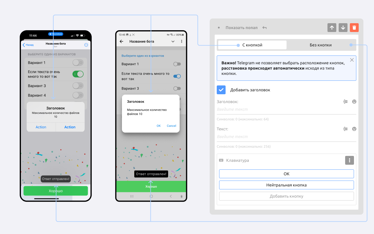
A popup window with text that can be triggered from the additional settings of any block.
There are 2 kinds of popups: With a button and Without a button.
Settings tab
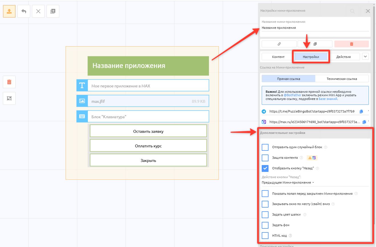
Every app has a Settings tab, which contains links, additional settings, and search settings.
Links
Types of mini app links
In the puzzlebot account, there are just 2 types of mini app links:
Direct link — looks like
https://t.me/username_bot?startapp=10e220a237218f61for Telegram orhttps://max.ru/id123456_bot?startapp=10e220a237218f61for Max; the ID of the mini app is at the end of the link.
Where to use it: you can put it in text, in buttons, and anywhere else to open the mini app.
Important! To use it with a Telegram bot, enable Mini App mode in @BotFather, as described above.
Technical link — looks like
https://cp.puzzlebot.top/web_page/test.html?id=10e220a237218f61; the ID of the mini app is at the end of the link.
Where to use it: it is intended solely for setting up Mini App mode in Telegram and for creating short links in @BotFather, as well as for enabling a mini app in a Max bot.
You cannot open it directly, and you cannot insert it as a link in text.
Important! Telegram clients are having issues with Direct links; we have described how to fix the error.
Besides the Direct link, there are two more ways to open a mini app: the Short link, which looks like https://t.me/username_bot/miniapp, and the Start link, which opens the mini app's main page: https://t.me/username_bot?startapp . Both are described above.
Additional settings:
Send one random block — when the app opens, only one random block out of all the blocks added to the app is displayed.
Content protection — prevents text from being copied and disables the right mouse button. Works only in Telegram.
Show the "Back" button — the button is shown in the upper-left corner of the mini app window instead of the "Close" button. You can choose one of the following actions for it: Previous mini app, Go to a mini app or mini story, Go to a command or condition.
Show a popup before closing the mini app — when the mini app is being closed, a popup appears with the warning "Changes you made may be lost". It is always shown for mini apps with input forms.
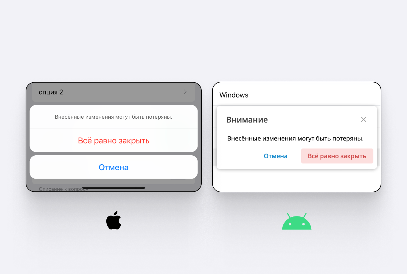
An example of the popup shown before the mini app closes.
Close the window with a swipe down gesture — Telegram may misinterpret fast page scrolling and close the mini app window when it shouldn't. You can turn this feature off, and the window will then close only when the "Close" button is tapped.
Set header color — here you can set the color of the top part of the app.
Set background — here you can set a separate background color for the app.
The header color and background apply only to the selected app. The general background and header color settings for all apps (or pages) are under Settings (bot) → Mini apps → Appearance.HTML code — Lets you insert HTML code into the current app page between the <head>...</head> tags.
Actions tab
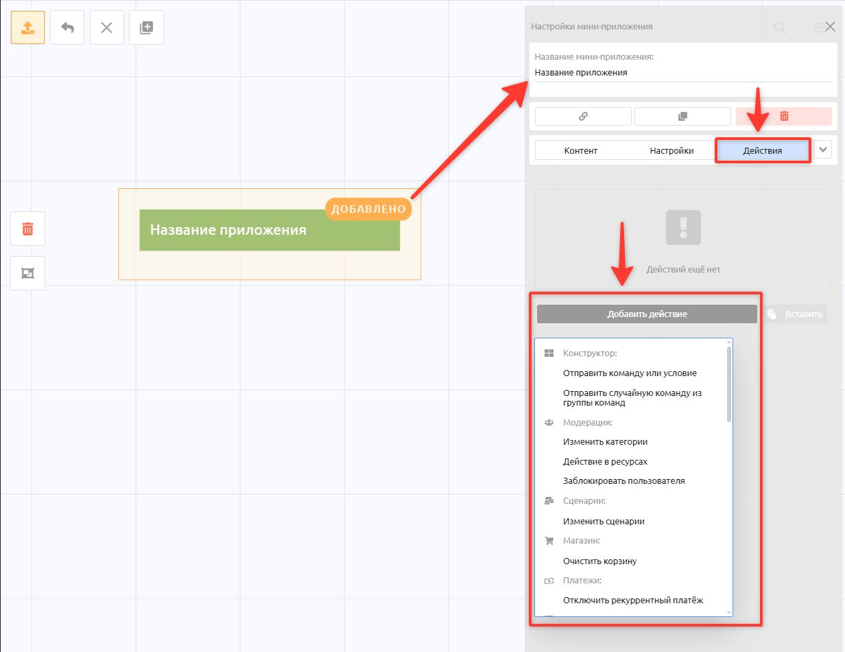
The Actions tab is where you create additional actions that run in the background after the app is opened.
The list is quite extensive and includes all the actions you may need, such as writing to a table, changing variables and categories, sending API requests to external services, and much more.
General settings and appearance
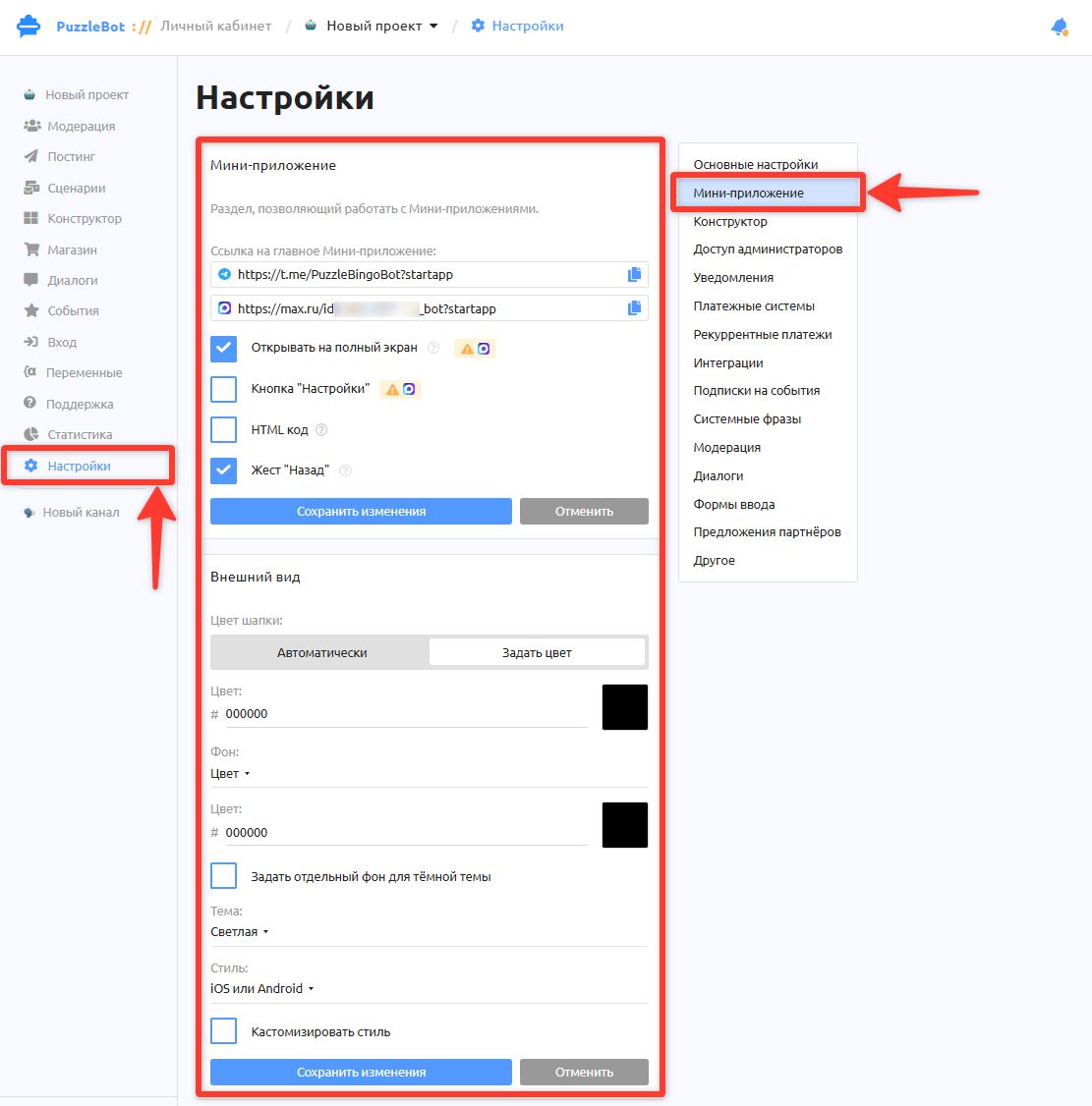
Under Settings → Mini app you will find the general settings for the app and its appearance. These settings apply globally to the whole app.
Settings
Links to the main mini app
Open in full screen: The mini app opens without the header that shows the bot's name. Available only in Telegram.
"Settings" button: Adds the native Telegram Settings button in the corner of the app.
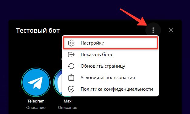
"Settings" button
HTML code: Lets you add shared HTML code that is inserted between the
<head>...</head>tags on all mini app pages."Back" gesture: When on, the "Back" action can be performed by swiping from left to right.
Appearance
Here you can set your own header and background colors for different themes and choose the iOS or Android style.
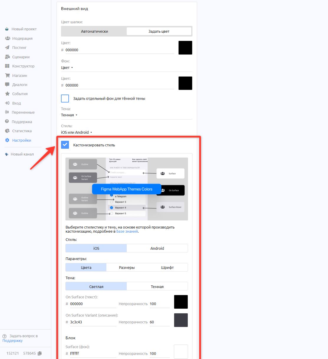
Select Customize style to open the advanced settings:
• Colors: for backgrounds, buttons, links, and text.
• Sizes: Corner rounding, spacing, and margins between blocks and edges.
• Fonts: Lets you specify other fonts for headings and text.
Short link to a mini app
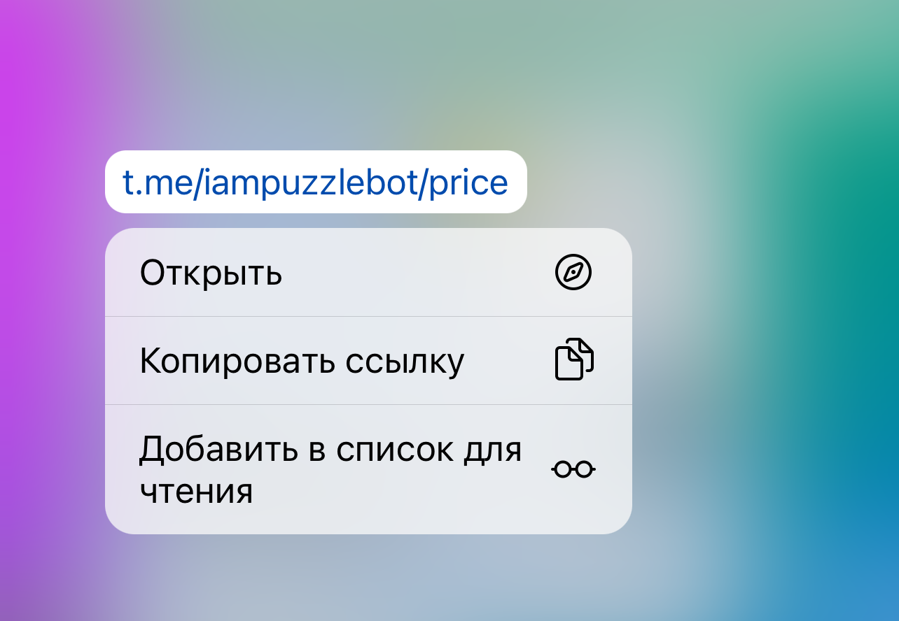
An example of a short link to a mini app.
To create a short link to a mini app:
Open @BotFather.
Enter
/newappSelect the bot you need and follow the steps: enter the mini app name — a description — send a picture (for example, from Yandex) — send a GIF or send
/emptyAt the step where a link is requested, send the Technical link again: puzzlebot account — Constructor — select a mini app that is already created and published — Settings — copy the Technical link and send it to @BotFather (see the step-by-step instructions with screenshots above).
As the last step, set the ending of the link, for example "price"
Other
The Insert text button action requires inline mode to be enabled. Learn more: Inline mode for inline commands and command groups in the Constructor.
You can integrate your own website into a mini app. Learn more: Connecting a mini app to a bot button (web bot).